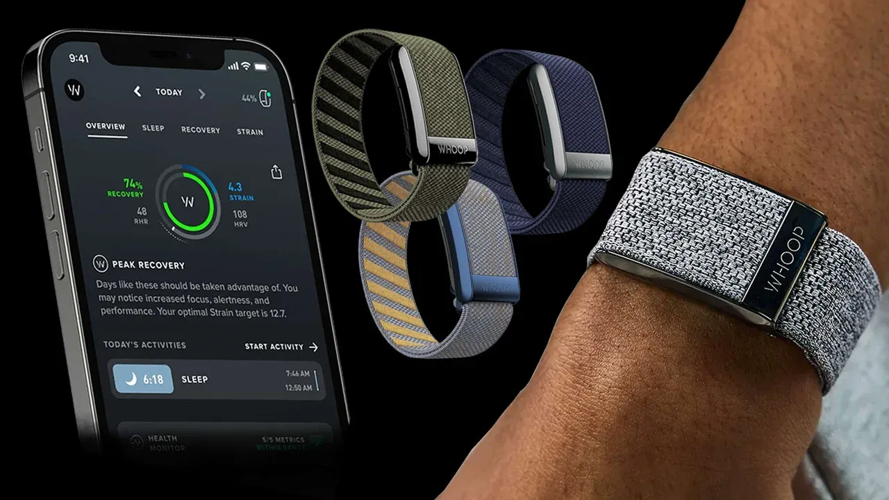
The Whoop Health Tracker Seems Simply Different
Yesterday, I had an intriguing conversation with Till about the Whoop wearable, which sparked some remarkable insights for me.

The Whoop is a health and fitness tracker without a screen, worn around the wrist. I find its screenless design more elegant and fashionable compared to a typical smartwatch. Its battery lasts about a week, making it convenient for night-time use, especially for sleep tracking.
A strength of the Whoop seems to be its data-driven approach. The accompanying app asks the user for daily input to a customizable survey that tracks those metrics which are most relevant to the owner. For instance, you can decide to record your alcohol consumption or the time of your last meal. This personal input, combined with the device's tracking capabilities—measuring heart rate, skin temperature, sleep duration and quality, among other things—allows the app to detect insightful correlations.
All health data is synthesized into a simple color-coded score, that turns green, yellow, or red. From what Till told me, the value of this simplified metric for the user seems to be remarkable. It translates complex data into understandable terms, like how eating late might turn my score yellow the next day. Till shared how this simplicity is often more satisfying and clarifying than navigating through complex dashboards.
A second, related insight is the social benefit of sharing this metric in our connected world. Users can opt in to connect and share their Whoop scores with others. A red dot in the app can then serve as a subtle clue of how the other person feels. It's a remote way of noticing when someone is off and asking, "How are you? You don't seem well today."
Most things that the Whoop does can be done by other trackers, like the Apple Watch, as well. Still, the simple, elegant, and data-driven approach strikes me as something remarkable and worth watching.