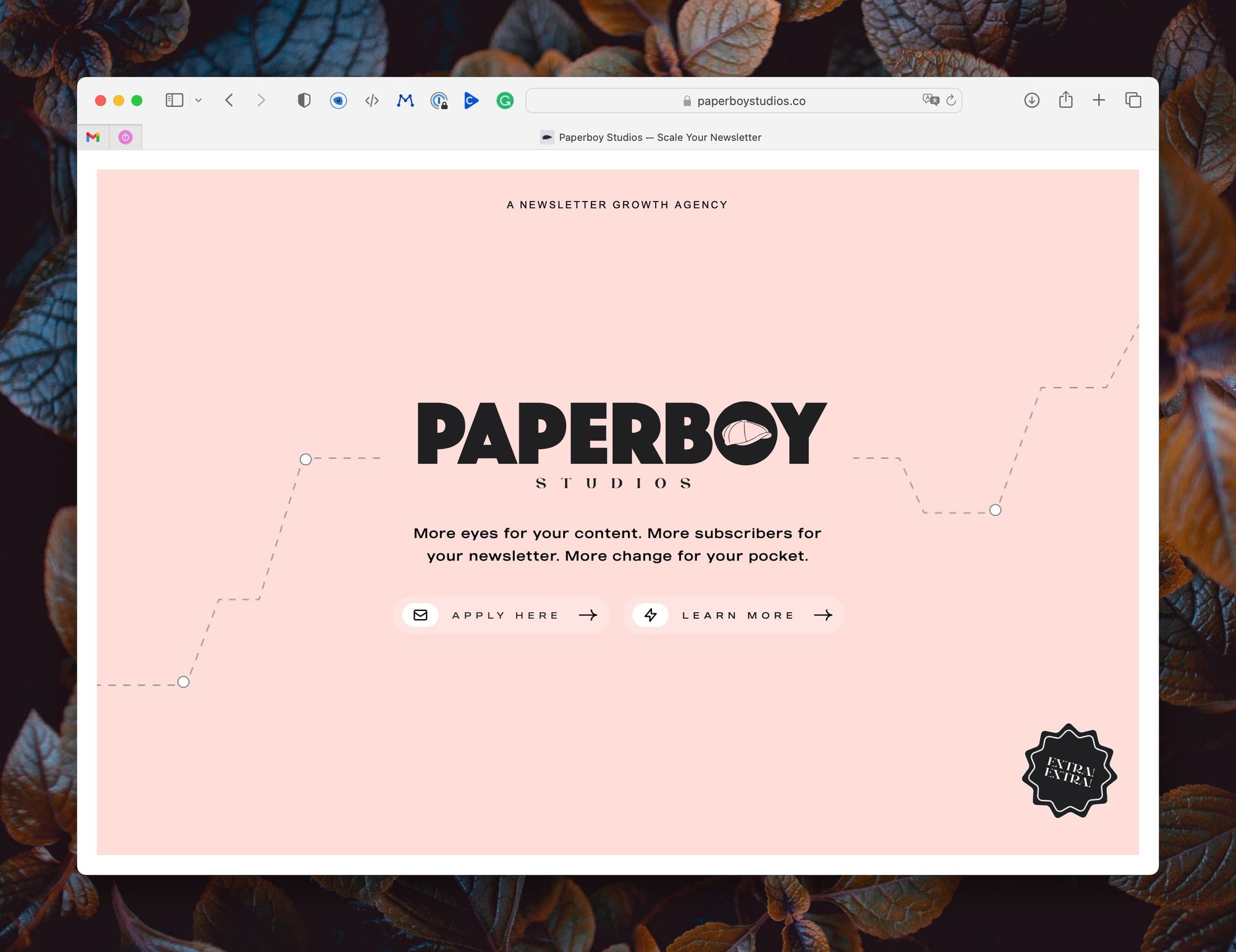
Paperboy Studios’ simple landing page
The simplicity of this landing page amazes me. While websites are reasonably easy to build it can be hard to design a coherent good looking one. These guys went with just one page. No scrolling possible.

There are two call-to-actions:
- “Apply here” is the most important one, so it’s left.
- “Learn more” which opens a PDF.
The media break from the website to opening the PDF (learn more) elevated my attention. I know how to read a PDF so it was no big deal. Returning to the website I found myself looking for more options but found only one: applying or not. It’s simple and my guess: it is effective.
So for your newsletter, project, or personal website, why not start with just a single page?